CYA!

September 2025 - Present
CYA! Is a social tool that localizes all the processes and information needed to create plans with friends. CYA! removes friction caused by communication issues and not only loosens the process, but speeds it up by allowing users to create plans between friends, family, and peers with no stakes, and as little text communication as possible
CYA! ditches classic social media tropes for ease of access and usability that helps people coordinate real-life hangouts instead of chasing engagement online.
Although this is not finished, here is a link to a work in progress high fidelity prototype, I implore you to check out the different flows: CYA! PROTOTYPE
CASE STUDY
The crux of this project is that it becomes increasingly difficult to create plans or schedule hangouts because of a variety of week-to-week schedules that exist between people in social groups. Trying to align a single event around four people with different availabilities is never easy. Commonly, people will use messaging apps, social media, and other apps to create plans that never see the light of day. It's difficult to get everyone on the same page. My friends and I are repeat offenders of this same issue; it is a recurring conversation we have before planning.
Behind many iterations of app ideas I had surrounding the general idea of spending time with friends, or going to travel, I noticed the hole in getting everyone together at the same time.
Group chats can be chaotic and potentially frustrating. Using multiple medias to to plan is way too much effort, and the confirmation needed from each person takes too long. How might I help friends coordinate plans quickly without creating another social media platform?
The problem
Research

During my competitive analysis, I found a few apps that are set up similarly. A lot of social planning apps rely on direct messaging and confirmation via text. The goal behind CYA! is to eliminate texting in the app. The structure and tools provided should provide enough detail so that the user does not need to fish for extra information. Creating conversation around planning convolutes planning and has the potential to completely erase existing plans.
Pain Points:
The biggest pain points I found came from the constant nudges to buy into "Premium" services, direct messaging, calendars, and social media-style feeds, all pulling away from the app's original functionality.
Direct messaging detracts from the product's design by forcing users to take an alternative route to planning. If you have to text to confirm plans or add details, the planning should have started in text form
Ideation


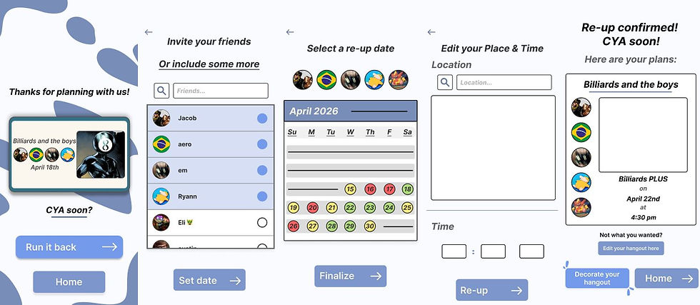
The ideation phase of this project focused highly on pairing communicative and highly legible language with indicators through the user's journey to create easy-to-understand steps when planning events.
Starting with the drawable user flows made it easy to transition to low-fidelity prototypes and high-fidelity prototypes soon after.
I studied competitor interfaces and designs that aligned similarly to what I was trying to accomplish visually. One design choice that really worked was Apple's wallet app structure. They stack your cards on top of one another, creating a system that allows each card to be distinguishable from the one behind or in front of it. That stacking design became my main display for hangouts in the main menu and works well for giving users visual clarity and prioritizing what's important to users.
A key decision I made when designing this project was giving users the freedom to have some fun in customizing their experiences. Users are able to customize the image and colors of their hangouts, filter/sort plans alphabetically or by friend, give friends custom nicknames, etc.. The goal is allowing users to adjust what isn't ideal for them in a way that doesn't destroy the structure the product is built on top of.
Access to a backlog of plans was another feature that worked out really well. Easily allowing users to reschedule what was done before works in their advantage. A couple buttons away from being able to make reoccurring plans or a complete rescheduling of successful plans provides insurance and low stakes


Final Solutions


The final solutions of CYA! are combinations of ease of use and containing all the information from past, upcoming, pending, and far out plans. Giving the user more information than what they bargained for can be overwhelming for them, so giving them ways to view what information they want, and organize it however, felt like a strong decision when designing the information architecture of CYA!. Visual indicators helped the most when needing to point users in specific directions or encourage them to take steps they may not know are available.

Reflect
This project and case study have helped me define my skills in developing case studies for issues. It has helped me locate an issue, iterate on how to solve said issue, and articulate the designs choices that were used to help solve these issues. The project started as many different things before it became what it is now. It was an app to help travelers understand currency differences between their native currency and foreign ones, then it was a travel itinerary app that would allow you to share your travel plans with friends without complications, it became a more localized social media about traveling and hanging out with the ability to invite your friends to do the same, and finally, an app that allows you to schedule hangouts in the real world, in real time, quickly, and without the engagement and filler content that social media provides. I'm very happy with the results of this project, most importantly, it has helped me through all stages of ideation and supported my learning for skills in developing intuitive UI and easy to use apps which strengthened my UX Design skills.

The evolution of user flows, screen-to-screen, has really been fun to develop. I have the most fun building these flows and seeing how they work in comparison to the rest of the product. It is important to me that the consistency remains screen-to-screen. It helps with user satisfaction as it prevents them from having to essentially learn two or three new apps within one.
What I found that did work:
Research showed that social planning apps utilize calendars to display when users have plans coming up. I think that is likely the best way to display that information, but calendars can get dense and unorganized if not monitored closely. There also seems to be a consensus on being able to customize the color and imagery of plans. I most agree with the method of inviting your friends. Across my research, plans in motion are confirmed by accepting or denying the plan request sent, while keeping the plans active if people cannot make it.