APPLE UI/UX EVALUATIONS
Evaluating games for Apple Arcade is an ever-growing experience that allows me to evaluate, critique, appraise, and iterate upon the UI/UX's across many Apple Arcade titles that are in development, pitched, and even completed. I have analyzed onboarding, user interfaces, and user experiences.
The goal was identifying challenges and opportunities for improvement while building a deep understanding of why games are successful and for what reasons
With a strong passion of games and the gaming industry, I wanted to study the metric of success. What is considered when approaching onboarding, design, and engagement. With the opportunity of being able to analyze Arcade titles, I was able to practice this first hand and slowly build this muscle by identifying pain points and giving articulate recommendations with the user in mind.
MY ROLE:
-
UX Review across Apple Arcade titles
-
Documented usability and friction
-
Assessed player experience
-
Produced recommendations for UX improvements
-
Assessed playability of games on mobile devices
Work
Catan Arcade
One of the games I evaluated was Catan Arcade. The game felt like it had a lot of potential to play really well with some tuning and expected updates to the build. There were several QOL improvements that could enhance the overall flow of the game by reducing some interruptions during gameplay.
Focus:
-
Size of the icons in-game
-
lack of tutorial
-
Visual hierarchy
-
Interaction Design
Findings:
-
Small UI elements
-
Missing Tutorial
-
Misleading UI
-
Lack of Information
-
Non-Progression Bugs
01
02


03
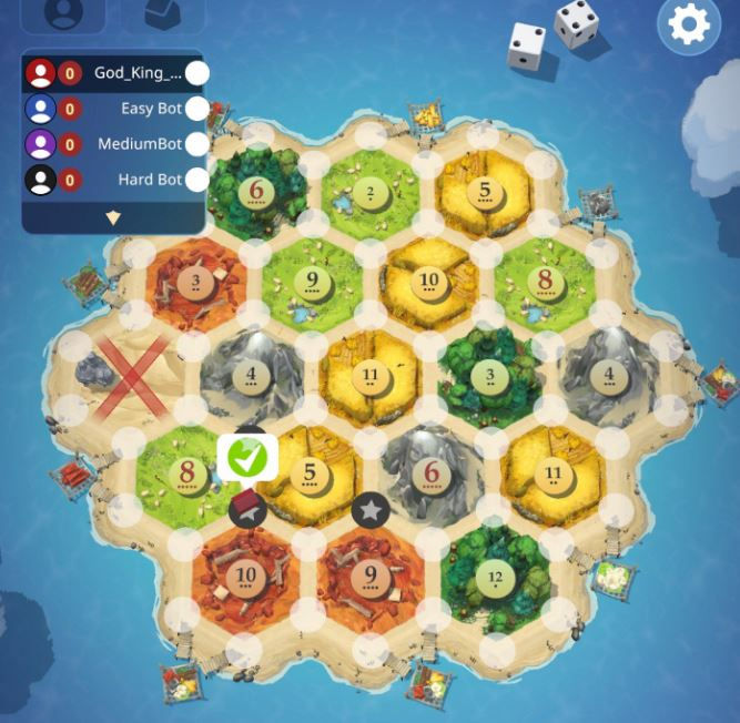
Image 01 is an example of a Visual Hierarchy error I came across. The green check mark is not what confirms the action they are requesting players to make; however, it pulls the most visual attention away from what is actually the "confirmation" they are trying to convince players to make. To fix this, a separate confirmation button should be placed elsewhere to control some of the misclicking players may come in contact with.
Images 02 and 03 are examples of not showing enough information, or information that is not important enough. In image 02, those cards are part of crucial point scoring elements in the game, and there is no information anywhere on how to achieve these points. Each card is part of a larger metric that requires you to collect "x" amount of a specific card. Adding how far away the player is from these elements would help tremendously, I was scoring the points and cards required without knowing how. In image 03 the history of the dice rolling served no purpose to the game and becomes obscure under the context that "SOMEONE" rolled a specific number; you quickly lose track of who this someone is
Heroes of Might and Magic
Heroes of Might and Magic is an interesting twist on strategy and turn-based simulation games. A customizable experience helps the game moves at the player's pace rather than the pace the game expects you to move at, which is a huge plus for a game like this. As expected, the game is hefty, similarly to the games in the series that come before it, but the UI is very readable and easy to understand without any confusion. Multiplayer taking the backseat in a game like this could be a huge plus for members of Arcade as they aim for single player experiences
Focus:
-
Size and purpose of the icons in-game
-
Tutorial
-
UI
Findings:
-
Helpful Icons
-
QOL adjustments
01

02
03
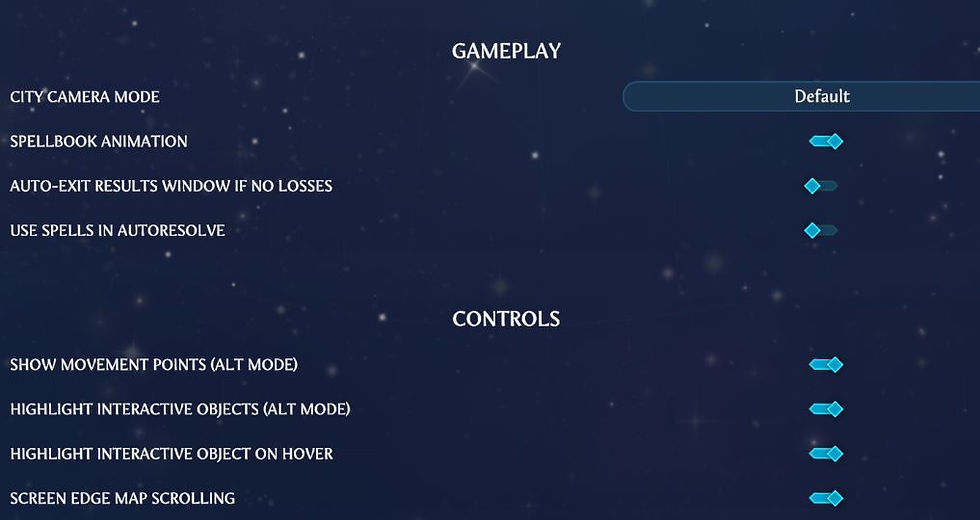
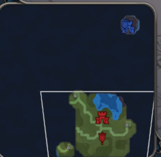
Images 01 and 02, within context of the rest of the game, display fantastic Iconography. The progression of Heroes of Might and Magic can make everything look extremely cluttered; there are over 30 different icons on the map which should make it harder to read. However, after getting to that point the skull and castle icons remain anchor icons that the user is always familiar with in game. The UI of the map never made me feel like I was unsure of what everything meant. You can also zoom in and out, drag around the map, place the map in a different spot on the screen, etc. there are ways for players to create their own IA as they play. Image 03 celebrates the great QOL options they have present in the settings. It creates a seamless and customizable experience for users to enjoy with no issues or friction.
DogHaven
DogHaven is a relaxing, comfort-type game that has a lot of options for unique, customizable experiences for users, but relies on a simple game loop that is almost unchanging and lacks any sort of consequence or challenge. For users more in tune with this style of game, I think it works well within its intended formula, but could use some work in breaking up the constant action
Focus:
-
Lack of game loop (never ending action)
-
FTUE
-
UI
Findings:
-
Visual Clutter
-
Reward system auto-redeem
-
QOL adjustments
02
01
03


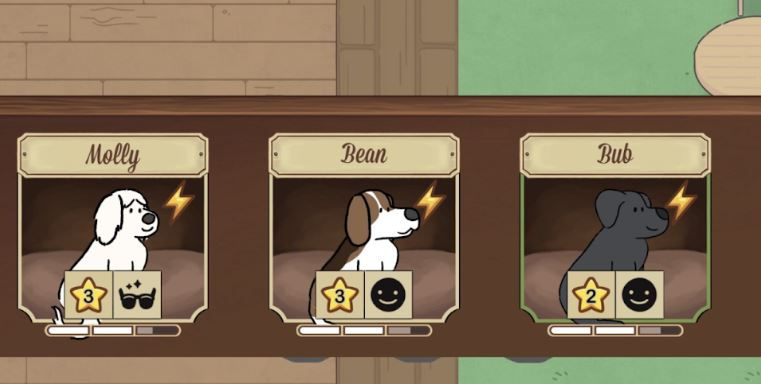
Image 01 displays visual clutter. The gifts that the visitors leave will stack onto each other or even populate in other places like tables or chairs. Having to pick up each of them individually seems unintuitive even though you can pick them up “through” each other. I think collecting one should collect all of the rewards and show a summed reward of whatever is earned. I.e., “8 red hearts” and “11 purple hearts” with the respective icons for each. Image 02 shows an interaction where when leveling dogs, the rewards you earn are not automatically collected, they should be for QOL reasons. There is nothing that prompts you to collect it either. So, if you miss the small animation shown on the reward, you miss the reward. 03 is a screen that allows you to give a dog to an owner, sometimes, multiple owners arrive at once. In that scenario, you have to give a dog to an owner, go back to this screen, and rinse and repeat. For QOL and ease of use, it would be nice if you could just give a dog to each visitor without having to leave this screen.
GAMBONANZA
To start, this game is beautiful and keeps its style consistent as you play through it. The FTUE explains the buttons, icons, and HUD well enough that you understand the concepts of the game but also gives you the opportunity to explore on your own as you play. Gambonanza is one of the most interesting and well-rounded roguelikes I have played in a long time. It creates challenges with a system that fights back as you play and forces hard decisions and sacrifices along the way. It provides a great style of gameplay that forces you to prioritize gambits and other things over elements you directly play with in game.
Focus:
-
FTUE
-
UI
-
Icons
Findings:
-
Aesthetic
-
Lack of Confusion (Good)
-
Mystery Icons
01
02


03

Image 01 shows different control schemes players can utilize that fit their style of play. Drag and drop and click to move are perfect options to have in a game like this, especially one on mobile devices. Giving users the freedom to choose is liberating and prevents a lackluster UX with mis clicking and even fat fingering. Image 02 is the only example in game where the icons confused me, the lock and unlock icon seemingly served no purpose as I continued to test what purpose they could serve in the game. It is also the only unexplained icon in the game. Image 03 is basically the encyclopedia of the game as a whole, which, in a game as dense as this one, is extremely reliable.
Tiebreakers
Tiebreakers is a fun run and gun style side scroller that benefits well from its distinct art style and visual aesthetic. While I enjoyed the gameplay on both mouse and keyboard and controller, I am having a hard time imagining trying to play this game accurately on a mobile device no matter how big or small. There are a lot of controls that would likely be difficult to condense into a manageable HUD on mobile. Moving and shooting can feel uncomfortable because the angles are locked to diagonal, straight, up, and down. The lack of a free aim could prove to be a real problem for mobile devices. I do enjoy the gameplay however, it is charming and simple, pretty fun.
Focus:
-
UI
-
UX interaction
Findings:
-
User flow errors
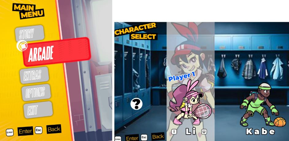
Both images sample UX errors in the user flow. There is a button named "Quit Menu" in the pause screen. “Quit Menu” is confusing wording and takes you back to the start screen of the game. The player needs enough of a clue to understand that they are going all the way back to the main menu. There is no clarification of where you'll land after hitting this button. These buttons should definitely land closer to where the player left off. Also, when you select arcade and are shown the character select screen, exiting from this screen not only does not prompt an “are you sure?” or ask for any other confirmation, but it also takes you all the way back to the launch screen. I made that error 3 or so times before I stopped, that is an extremely frustrating error to make more than once and hinders the flow of the game completely. A prompted warning after selecting these options would be convenient enough to stop this from happening. Or just fixing the landing destination of the buttons as well.
01

02
03